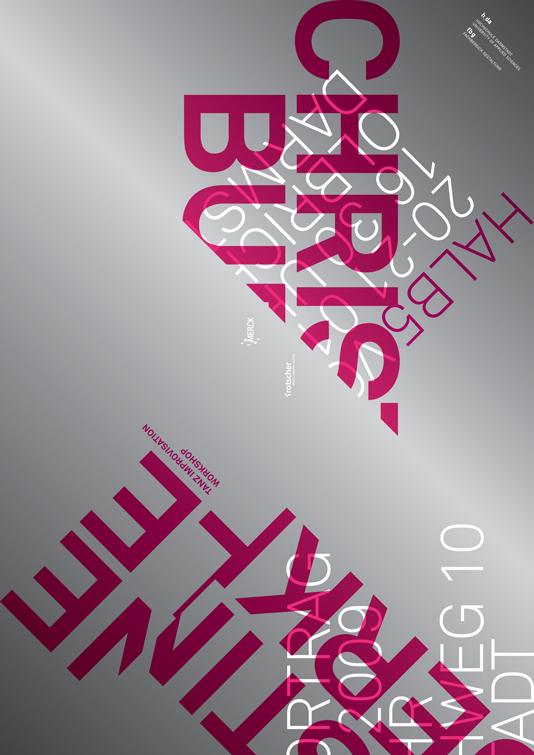
halbfuenf
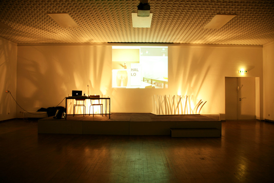
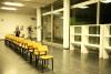
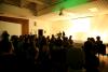
"Halbfuenf" presents each semester a series of public talks about all sorts of themes such architecture, design, science or music.
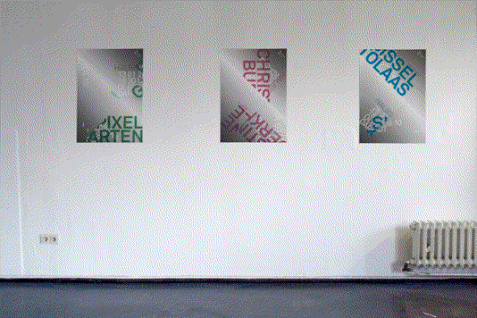
As a team we organized the whole project. Looking for sponsors, arranging the evening and those kind of things. The final design of the poster series is made by myself but I have to say without the team it would not be what it is now.
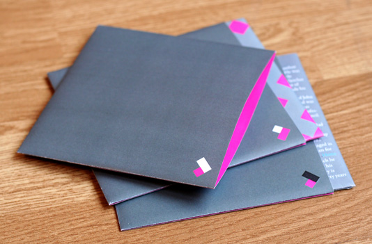
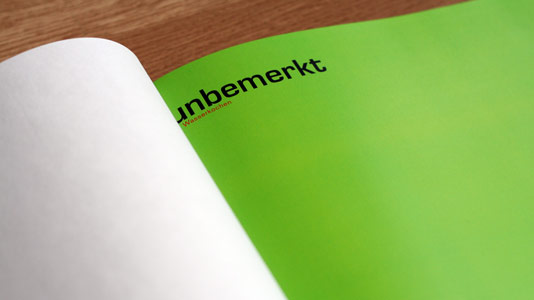
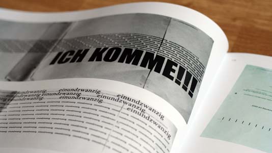
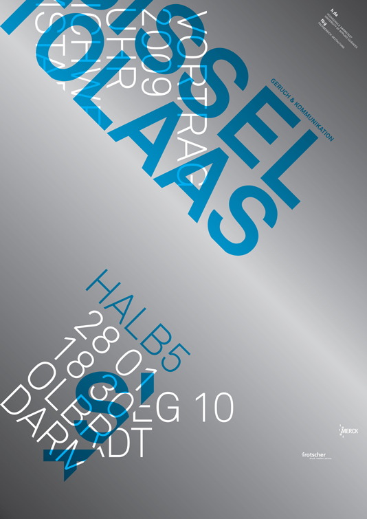
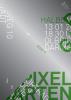
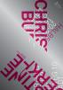
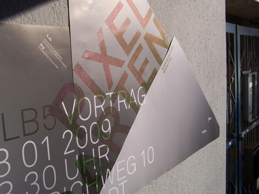
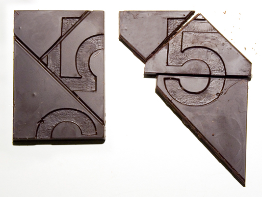
The concept is to have the same perforation but always a different shapes after putting them together. It was always important to me to keep the coasts as low as possible. Beside that fact that the posters look nice before ripping them apart. It was very efficient cause we had no offcuts and the perforation was the same for all three posters.
The posters are done in offset and screen print. The colored parts are screen printed with a effect pigment called 'arctic fire'. Depending on the angle your looking from the color is changing.
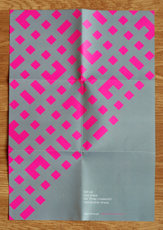
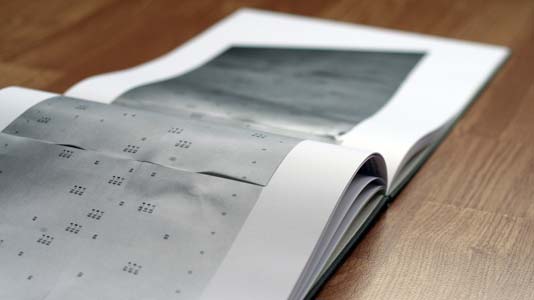
The posters were hung together and a week before the next event we changed the current poster into its form so the viewers eye was attracted again and the information legible.
halbfuenf // Pixelgarten // Christine Bürkle // Sissel Tolaas
________________________________________________________________________________
________________________________________________________________________________
________________________________________________________________________________

________________________________________________________________________________
As a team we organized the whole project. Looking for sponsors, arranging the evening and those kind of things. The final design of the poster series is made by myself but I have to say without the team it would not be what it is now.
The concept is to have the same perforation but always a different shapes after putting them together. It was always important to me to keep the coasts as low as possible. Beside that fact that the posters look nice before ripping them apart. It was very efficient cause we had no offcuts and the perforation was the same for all three posters.
The posters are done in offset and screen print. The colored parts are screen printed with a effect pigment called 'arctic fire'. Depending on the angle your looking from the color is changing.
The posters were hung together and a week before the next event we changed the current poster into its form so the viewers eye was attracted again and the information legible.
halbfuenf // Pixelgarten // Christine Bürkle // Sissel Tolaas
________________________________________________________________________________
________________________________________________________________________________
________________________________________________________________________________


________________________________________________________________________________
score - Mon, 11:12